Browsing Tag

blue

opi spring 2008

OPI Spring 2008 – India Collection

Saturday, 30 January, 2010

30 January, 2010
12:43AM

I have 10 out of 12. URGH!!! I can laugh now, but at the time I was about to tear my hair out! Someday I’ll get the last 2 colors — MonSooner or Later and Moon Over Mumbai. Then I can add it to the swatches here. 🙂

Overall, not sure what the heck was going on with the brushes in this collection. The bristles were a bit too thick and some had minds of their own! The formula wasn’t too bad…something I could easily deal with.


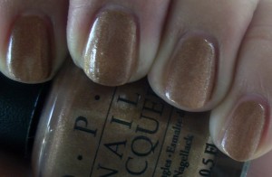
Charmed by a Snake
Shade (Top); Overcast (Bottom)
It looks a bit gold, yet slightly bronze on me. When I wore this color 2 summers ago, I disliked it because I had acquired a tan, making me even darker than I usually am (*cues* mommy voice, “Carinae, YOU ARE SO DARK!! YOU WILL NEVER GET MARRIED.” *as mommy makes the sign of the cross and prays for my immortal soul*) and it made the color appear this pallid, pathetic bronze on me. While this time around it’s infinitely more charming I still have bitter memories of that bronze shade.
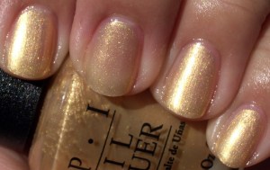
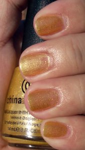
Curry Up Don’t Be Late
Shade (Top); Overcast (Bottom)
I’m not one for golds, but this wasn’t so bad. It’s pretty lightweight and I felt it was more of a sheer than an actual opaque. I also had issues with it because there were a few jacked up errant bristles that really got in the way of application.
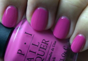
Elephantastic Pink
Indoors, No Flash (Top); Indoors with Flash (Bottom)
Wow…talk about BLING BLANG BRIGHT! ’nuff said.

Get Me To The Taj On Time
Indoors, no flash (Top); Indoors with Flash (Bottom)
Pretty little sheer with a slight hint of an iridescent shimmer…I’d wear this again for sure.
I’m Indi-a Mood For Love
Indoors, no flash (Top); Indoors With Flash (Bottom)
The name alone made me giggle. I’ve got to say, they’ve nailed it head on with the whole Indian pink shade here. It really popped a lot more in person…and when I put this on, I smiled remembering my time in India.
Lunch At The Delhi
Indoors, No Flash (Top); Indoors With Flash (Bottom)
Oh…it’s a coral color. It is *so* not me. I’m not 60 yet.
Keys To My Karma
Shade (Top); Sunlight (Bottom)
I liked this red…kinda tomato-y, kind of maraschino cherry…it’s almost got a retro vibe to it. Kind of power color ‘bitch in the boardroom’ kind of thing. Very Alexis Carrington!
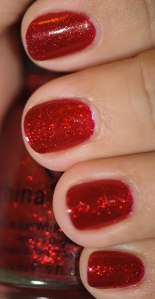
Black Cherry Chutney
Outdoors in Shade (Top); Sunlight (Bottom)
This was my staple color until the end of 2008…we moved to India and I didn’t want to haul my stash of nail polish – I just bought more there instead. 😉 …And that’s only 3 bottles of swatching. I left behind so many. Not one of my finer moments…I thought I was going back, but as it turns out, I never did. 🙁 Anyway, what I truly love about this color is that it’s got a hint of an orange/pink shimmer running through it. In the bottle, I saw it and went, “oh…a padparadscha sapphire kind of color!!” I had to buy it. But when I put it on, I nearly wept from the sheer beauty of it. The pictures don’t do it justice at all.
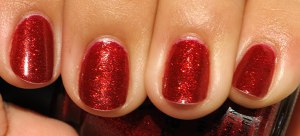
Royal Rajah Ruby
Outdoors in Shade (Top); Sunlight (Bottom)
A super pretty shade of red that I’d wear here and there, but Black Cherry Chutney was the one that I still love…I am going to have to get a back-up bottle before it’s too late.
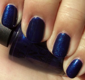
Yoga-ta Get This Blue!
Outdoors in Shade (Top and Bottom)
Ok, I can’t even begin to explain how much I love this color. It got 4 pictures in here! I loved Russian Navy and I thought this would be a ghetto sister to it…oh no. This one really stands out on its own. It’s this navy color that’s got a lovely shimmer running through it. Absolutely freaking gorgeous. I know the swatches may look identical, but the subtleties are there, I promise! 🙂
Yoga-ta Get This Blue!
Sunlight (Top and Bottom)
china glaze nail polish swatches spring 2010 Up and Away Collection

China Glaze – Spring 2010 – Up and Away Collection

Thursday, 21 January, 2010

Couple of notes – the flash distorted some colors and I’ll let you know where. Also, it’s a big collection – 12 colors. So this post is pretty image heavy.

Despite the fact that I have an intense dislike for pastels, this collection for Spring 2010 that China Glaze has put out totally does it for me. I’d wear all the colors except Happy Go Lucky, High Hopes and Peachy Keen.

I’d have swatched this outdoors, but it was raining cats and dogs….and my impatience got the better of me. 😀

Last note: the formula was wonderful – only 2 coats were needed.

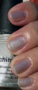
Light As Air
No Flash, With Flash
I loved this light lavender on me…it had a hint of grey that was more thanlikely brought out by my skin tone. But whatever the case may be, love this color.
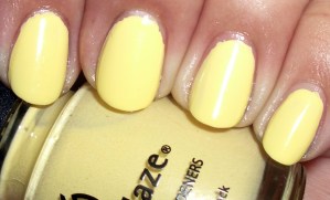
Lemon Fizz
No Flash, With Flash
I never thought I’d like a pastel yellow, but the pictures make it look somewhat flattering on me…it’s not when you see it in person. It brought out the yellow undertones in my skin and it wasn’t pretty.
Something Sweet – No Flash, Flash
A light pink that is definitely very sweet!
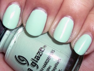
Fe-Fresh Mint – Flash, No Flash
A very pretty minty green. I almost expected it to smell like mint, too! It didn’t. Very bright on me, but a fun color. I’d wear this.
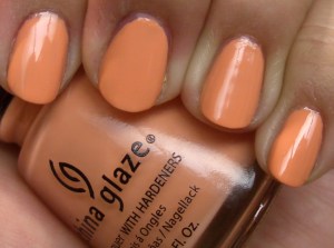
Peachy Keen – No Flash, Flash
Funnily enough, it looks like a peachy orange on me.

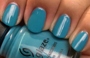
Flyin’ High – Flash, No Flash
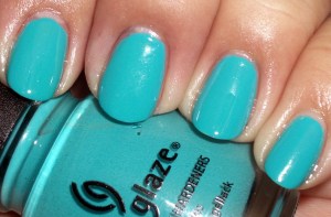
Not quite kickin’ green, but it reminded me of turquoise.
The flash distorted the color in the bottle and on me. It’s actually a great color…and I’ll be wearing it!
Four Leaf Clover – Flash, No Flash
This color was so difficult to capture. To be honest, I was a bit thrown off because they look almost completely different. Maybe it’s me, but this color is one you have to see in person – absofreakingly gorgeous. Flash distortion played a big part in this, but … WOW do I love this color! Maybe I can start to finally stray from dark/black nail polish…
Happy Go Lucky – Flash, No Flash
Yellow. Yikes. I was tempted to paint smiley faces when I put this on.
Heli-Yum – Flash, No Flash
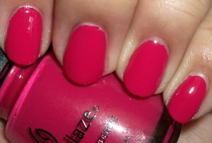
This is just like seeing an electric raspberry on my nails – completely enjoyable!
High Hopes – Flash, No Flash
I was baffled with this color. I ended up scratching  my head a few times, too. I took the pictures then thought I hadn’t cleared off the memory card because there was some strange orange/pink swatch, then an orange swatch where the no flash ones had been taken. It finally sunk in that the color changed a bit (more like a lot) in the flash. I don’t know what to say – you be the judge.
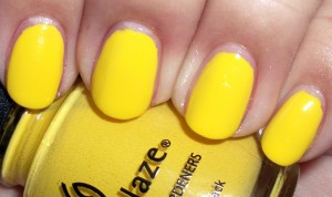
Sugar High – No Flash, Flash
Yowzers. The flash made this color even more bright than I thought possible!
Grape Pop – Flash, No Flash
I really like this purple. I was wanting a gorgeous royal purple creme without any shimmer or glitter. It was totally nailed here – love it <———— this much ————–> ! Thanks, China Glaze.
fall 2009 spring 2010 the wizard of oh ahz returns

China Glaze – Fall 2009/Spring 2010 – The Wizard of Oh Ahz Returns

Wednesday, 13 January, 2010

How funny that I am listening to the soundtrack for Wicked as I post swatches and a small write up of this collection…I slack. I swatched these last month, but am only getting round to putting them up.

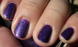
C-C-Courage
Indoors, luminescent lighting (L);outdoors, gorgeous sunlight (R)
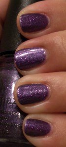
This is a royal purple with a twist – glitter. I’d love to see this color without the glitter because I think it would be able to stand alone. It’s beautiful.
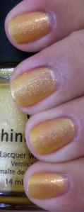
Cowardly Lyin’
Indoors, luminescent lighting (L) Outdoors (R)
Very interesting with a jelly yellow base. It’s a very odd cross for me because it’s almost like it was a primary yellow base with gold glitter thrown in to jazz it up and then they made it sheer when I thought it should be opaque.

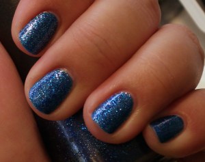
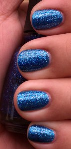
Dorothy Who? Indoors, luminescent light (L) Outdoors, overcast day (R)

Wow. It’s all I can say. I put this color on and I was absolutely speechless. I have never been a fan of glitter nail polishes. NEVER. But this. This…made me stare at my nails for a little bit. I mean…fascinated me while I took pictures. It’s a bit Dallas Cowboys blue for me, but it’s so damn beautiful. The pictures indoors and outdoors haven’t done this any type of justice.
Good Witch?
Indoors, flash (L) outdoors (R)
It didn’t go too well with my skin tone, but it’s definitely very pretty!
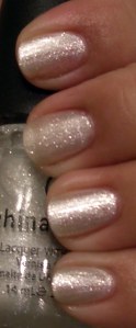
Ten Man
Indoors, luminescent lighting (L) outdoors (R)
Sheer and pretty. I thought it was similar to Tinsel from the Holiday collection, but it’s not. It’s also got a hint of white in it, but just enough to keep this silver. Diggin’ it!
Ruby Pumps
Indoors, luminescent lighting with flash (L); Outdoors, natural light (R)

Overall I liked this collection, but I had issues, massive issues with C-C-Courage…it tended to bubble up far too quickly, even when I put on the thinnest of coats. Maybe it was just me and the formula I got. I even waited 15 minutes in between the first and second coat. To no avail, it still bubbled. Urgh. It also took a while to dry, but the results were still spectacular.

I am not a fan of frosty colors or glitters…so this comes as a surprise for me to like them. Pity Good Witch? and Cowardly Lyin’ didn’t go too well with my skin tone, but face it…I was never meant to wear yellow…and ya know what? I’m perfectly fine with that.

Anyway, I wanted to address this – why did they call it Ten Man instead of Tin Man? Did someone hit the wrong vowel when typing it up and it just went out like that without anyone doing last minute checking?!

My favorite colors? Ruby Pumps, Dorothy Who? and C-C-Courage.