Browsing Tag

lavender

OPI Shrek Forever After Collection (2010)

Thursday, 6 May, 2010

This is a limited edition collection OPI released that is based on the new Shrek movie that is due out on May 21. I could be wrong on the date, but I can’t be arsed to look it up. Sorry. I’m too involved with the nail polish!

I was able to swatch these yesterday and I pretty much fell in love with all of the OPI Shrek collection. I like kind of odd, close to putrid colors…plus, these were crèmes, how can anyone not love crèmes?! Formula wise it was a dream – went on well with minor problems and dried fast. Yay! It’s a win, win all around.

OPI Shrek consists of 3 dark colors (blue, purple and green) and 3 not-quite-pastel, but I felt they were to complement the darker colors. Like a mani/pedi combo for the summer thing. Very tips and toes! Come and see what I’m rambling about.

Indoors and in the shade, this color didn’t look so bad on me. I loved the fact that it wasn’t like Sally Hansen’s Yellow Kitty. I thought it might be, but it wasn’t. This is definitely far more opaque and not at all hard to work with.

This is the sister color for Fiercely Fiona…well, at least I thought so. Shrek and Fiona should always be together, right? I love this type of green. It reminds me of a sweater I bought way back in the day. It’s this color. My cousin hated it. Hated it. Hated that shade of green. Made sure I knew it everytime he saw me wearing it. Yet he’d get so incensed when people would compliment me on it, always asking where I got it. When he died, I was tempted to throw that sweater into the casket so he’d spend eternity with it. How wrong am I? Thing is, everyone in the family understood and thought it was funny I was tempted to do that. Then again, that’s just my family’s twisted sense of humor. Some day I’ll share those with you, but for now I won’t.

This color wasn’t so bad on me, but it’s a pastel and pastels hate me. It’s ok. I hate them back. Yet I still try to wear them thinking that I look good in them. NOT.

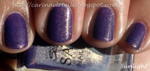
A very pretty purple crème that’s come a bit too late in the purple game. Sorry, OPI. I mean, I still appreciate it, but Nubar, Rescue Beauty Lounge and China Glaze have beaten you to the punch on this.

Out of the entire collection, Who The Shrek Are You? and What’s With The Cattitude? are my favorites. This isn’t quite as deep a turquoise as it could be, but it’s still pretty darn beautiful. The correct shade that I can really associate it most in terms of gem stones is called Sleeping Beauty Turquoise. Sleeping Beauty Turquoise is mined in Arizona. What makes it different from regular turquoise that is prevalent in Native American jewelry is the lack of intense color. It has a slight shade of purple that runs through it making it less bright, bringing it to a muted shade of turquoise that works well with my skin tone. When set in silver and gold, Sleeping Beauty Turquoise doesn’t look as ‘plastic’ as some other turquoise can. Ok, sorry, digressing. I love jewelry and making jewelry and I shouldn’t pull that into a nail polish post!

Not quite electric but not exactly dull, either. This was the first color I applied and had some issues in application because my brush’s bristles were a little on the uneven side. It took me a few minutes to get used to application and it shows. However, it doesn’t detract from the blue goodness of this color, does it?

OPI Shrek collection is out now…grab the colors while you can. I’ve a feeling they will go pretty fast.

Spa Ritual Spring 2010 Collection – Believe Collection (Part II)

Wednesday, 5 May, 2010

The second half of this collection focuses on the final three colors of the collection that were … not so great on me. The formula was still the same – wonderful. It dried fast, was a breeze to apply and no jacked up bristles. I had a minor problem that really was cuticle pull. You can see it all below. 🙂

You can see the cuticle issues on my middle finger. This pink had a shimmer in it that was meant for someone either younger or older, but not me. I’m very fussy about my pink nail polish and this is definitely not one for me.

See? Cuticle pull again! This orange…is orange. I love orange nail polish, but this was a bit too sheer and almost a jelly like quality. This is 2 coats and it’s still slightly sheer. Not sure if you can see that.

A lovely creme that I absolutely loved in the bottle. Sadly, it looks like I’ve glued some pastel colored M &Ms onto my fingers. It looks surreal and very odd. I was hoping that it would look ok on me, but it really didn’t. I love, love, LOVE this color. I really wish this would look good on me. Oh well…plenty of polish for me to choose from so I’m not lamenting my lack of choices. 🙂

Rescue Beauty Lounge – Purple Haze

Monday, 19 April, 2010

I’ve been on a bit of a purple/lavender polish kick lately. Not sure why…But here we go. I promised a fellow nail polish lover that I will post a picture of the purple color wheel I have, showcasing my embarrassing amount of purple polish I’ve collected.

Here is a polish on me! It’s not quite purple and it’s not quite lavender, but it’s a gorgeous shade!

china glaze nail polish swatches

China Glaze – Grape Juice

Tuesday, 30 March, 2010

I found this gem amongst my many bottles of nail polish…and I remembered why I fell in love with it. In the bottle it’s a bit uninspiring, but on the nails…oh, baby! 🙂

Nice and spring-y, wouldn’t you agree? I love how it looks in the shade.

Random Essie Swatches

Thursday, 4 March, 2010

Some Essie Swatches I’ve been meaning to upload, but kept forgetting…until now! 🙂

I thought I was gonna love this color when I put it on me. Nerp. Nope. Didn’t like it one bit…NOT ONE BIT. It almost looks like I’ve got skittles on my fingers, doesn’t it? LOL

Not a bad shade of a pastel. It’s not too obnoxious, but it will do. 🙂 At least it doesn’t look like Skittles. 😀

This is my favorite of the three. I guess when it comes down to it, I like purple – even if it’s lavender.

china glaze nail polish swatches

Random China Glaze Swatches

Wednesday, 3 March, 2010

I found these random China Glaze swatches I had done…don’t know when, but it seems like it was a while ago. 🙂

China Glaze’s tribute to Audrey Hepburn. They made a Tiffany blue just for her. As some or most of you know, Tiffany’s holds the patent for the blue so you can only get close to replication, but not the actual blue…or green. Or whatever color it is.

Secret Peri-wink-le

Indoors, no Flash (Top) and Indoors with flash (bottom)

Oddly enough…I really liked this color. It is a true periwinkle. While this color never looks good on me in reality, in my head I say it looks fabulous and keep on wearing it. 😀

Lubu Heels

Indoors, no flash (top); Outdoors (bottom)

Not one of my favorite colors. I thought this was the ghetto cousin of Midnight In Moscow. Yea, I went there.

Hong Kong Collection OPI Spring 2010

Spring 2010 – OPI’s Hong Kong Collection

Saturday, 13 February, 2010

13 February, 2010
4:29PM

Let me first start out by saying that there hits and misses for me in this collection. There are some bright colors in here and that’s what I’ll be showing first. They hurt my eyes…big time. I definitely enjoyed the rest of the collection, too. Very pretty and very not what I expected. I had seen it on some other people, but on me…I fell in love. For once, there was no black nail polish involved. 😀

The formula itself was pretty good, too…I normally have issues with cremes because I am little miss heavy handed in application. You’ll see it here and there throughout the pics but overall no problems. Please excuse the messiness of the manicures. I’m normally a lot more careful in application, but all the colors and the excitement got to me. Haha. Sad, but true.

As always, click to make the pics bigger!

A Good Man-Darin Is Hard To Find
Shade (L), Sunlight (R)
Yea, this was the brightness I was talking about…ouch. My eyes. They feel like burning!
Chop-Sticking To My Story
Shade (L), Sunlight (R)
Ok, for some reason, I loved this color…a lot. It’s not quite pumpkin orange on me and there is enough orange mixed in with a hint of brown that makes it very appealing. I normally would never wear something this color, but for some reason, this really made me excited!
Dim Sum Plum
Shade (L), Sunlight (R)
While it wasn’t my favorite color, I was having flashbacks to their previous Fall 2009 collection’s color Ate Berries in the Canaries. I’ll do a comparison side by side if I remember to after I do a write up on all of these. 😀 I won’t swatch it but I will put my previous pics up. DSP is a pink that I think will go well with people who love these kinds of shades. I really have to be in the  mood for this sort of color. While it’s fun to swatch, it’s not one I’d actively wear if given a choice.
Hot & Spicy
Shade (L); Sunlight (R)
Wow. In the bottle it looked like a bit of an orange coral. Out of the bottle and on me it looks like…an orange coral. Not me. So not me.
Red My Fortune Cookie

Shade (L) and Sunlight (R)
It’s not quite tomato and not maraschino cherry…It didn’t look bad on me, but it didn’t look good either.

Pearl of Wisdom
Shade (L); Sunlight (R)
Even in the shade the polish was able to capture a beautiful shimmer and give off a slight hint of the pinkness within. In the sunlight you can really see the prettiness. This is a sheer color and I think wearing it over a darker color would definitely be the best thing you can do with it.
Now this is where I think the Spring Collection starts to really shine…
Lucky Lucky Lavender
Shade (L) Sunlight (R)
This wasn’t quite as lavender as I was expecting. It’s really kind of…well, a pink lavender, don’t you think? I don’t know why, but the sun really washed out any hint of lavender in this color.
Panda-Monium Pink
It’s actually even prettier in person. I thought I had this confused with Lucky Lucky Lavender, but no…this was the correct bottle and swatch. I’m not a fan of pinks or pastels, but this didn’t stand out on my fingers like spring colored M&Ms. (BTW – love that I went a little nutso with the cleaning of my cuticle on my index finger?! Haha. Silly little Sally Hansen manicure clean-up pen.)
Meet Me On The Star Ferry
Shade (L) Sunlight (R)
Now this color…blew me away. Only because waaaay back in the mid 80s, I found a color by Sally Hansen that was very similar to this. I used it until it dried out and I threw it away. I never was able to get another bottle because for some reason, the jr high kid in me had managed to pick the ONE color that was a limited edition. That alone should’ve been an indicator on my nail polish obsession…anyway, here it is, looking just as good, if not better than what I had in high school. Beautiful berry with a lovely shimmer running through it. The shot of it in the shade reminds me of my much loved and much lamented Chanel’s Brown Sugar. This color really defines the collection for me.
Bling Dynasty
Shade (L); Sunlight (R)
I LOL’d mightily at the name of the polish. I cringed when I saw it in the bottle, but I fell in love with it when I put it on. What a gorgeous shade of gold this is. Definitely a keeper in my book!
Jade Is The New Black
Shade (Top); Sunlight (Bottom)
What rockin’ shade of green this is…I have a dark green that’s more forest green and a light green…and a minty green. I don’t have this kind of green…and I’m in LOVE. Very very pretty.
Suzi Says Feng Shui
Shade (L); Sunlight (R)
This is a gorgeous teal/dusty blue. In fact, it was a color I wanted to paint the walls of our bedroom in but Colin said no. I guess I’ll have to settle for it on my fingers! 🙂
arabian night commander in chic done out in deco drugstore polishes marine blue revlon rimmel scheming street wear

Drugstore Stuffs

Thursday, 11 February, 2010

10 February, 2010
11:23PM
So I made a trip to the drugstore and my friend also sent me some drugstore polishes…
I also did a comparison of OPI’s Done Out In Deco and Rimmel’s Commander in Chic.
Index and Pinkie: OPI’s Done Out In Deco
Middle and Ring: Rimmel’s Commander in Chic
I love mushroom-y taupe-y colors and was thrilled when I saw Commander In Chic. It cost $3.99 and was well worth it. It’s not breaking the bank, but I know some people have issues with paying more than 99 cents for a bottle of nail polish. I don’t know why I thought CIC was similar to OPI’s Done Out In Deco, but I put whatever it was I was smoking down and saw it all clearly. I’ll have to compare OPI’s You Don’t Know Jacque with CIC and see how it stacks against it each other.

Street Wear by Revlon: Scheming
I was so surprised that I really liked this color…I mean really liked this color. There are little gold sparks that show up when in direct sunlight. Application was mega easy and dried quickly. Pity this line was discontinued.
Rimmel’s Marine Blue
These types of shades always reminds me of the ocean…I know it’s meant to, but I love colors like these. It’s a pity they don’t look good on me, though. Ugh. I am going to be sending this color to my friend Lauryn.
Sally Hansen’s Arabian Night
A gorgeous purple polish with some rockin’ gold glitter to break up the purpleness. To be honest, I think the purple would’ve been really pretty without the gold glitter. Nonetheless, it’s still a gorgeous polish all together…pity it’s a real pain in the butt to remove thanks to the glitter. Not as bad as China Glaze’s Dorothy Who? in removal, but darn close!