Now first and foremost, Ji had to change the names on these colors because the estate of the artist who inspired this collection threatened to sue. I was incredibly saddened, but not entirely surprised…anything to make money, right? It’s not like she desecrated the memory or dug up some terribly horrible new info about the artist. Instead of this turning into a rant, I’ll show you the colors instead and you can read all about Ji’s drama llama with the estate itself. I was fortunate enough to procure the bottles with the original names, but I also procured a second set of the crossed out names just to give Ji a little extra love and support – she’s that kind of person for me.
Now that that explanation is out of the way, let’s get on with the collection. The formula for this was superb. I still suck at application, but I have to admit, I do love these colors. My swatches don’t do these bad babies any justice!
As always, please right click on the image, choose Open in New Tab and then click once on the image in the new tab for the full-sized image.
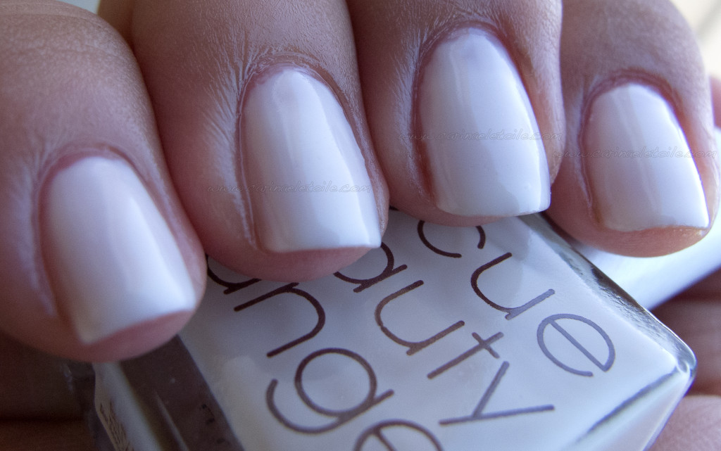
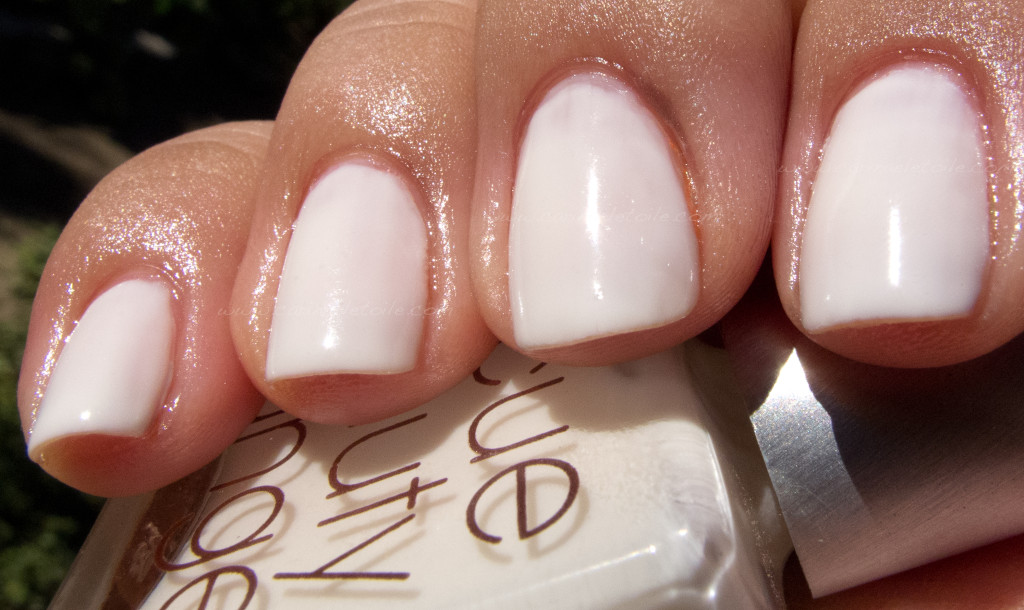
Bella Donna was a color that surprised me because while it was a bit of a milky white, I expected it to be chalky and a bit harsh. It actually wasn’t. I was extremely pleased with the application, despite the fact it looks like a hot mess on me here. This was the slowest drying one out of all the colors, but it had such a high glossy shine I couldn’t complain.
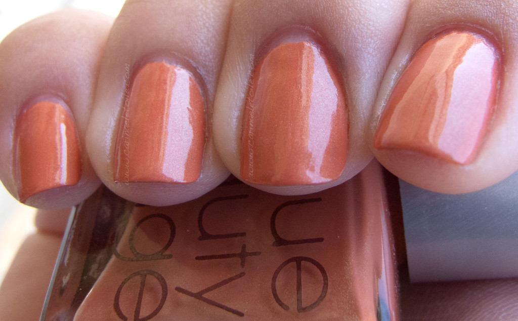
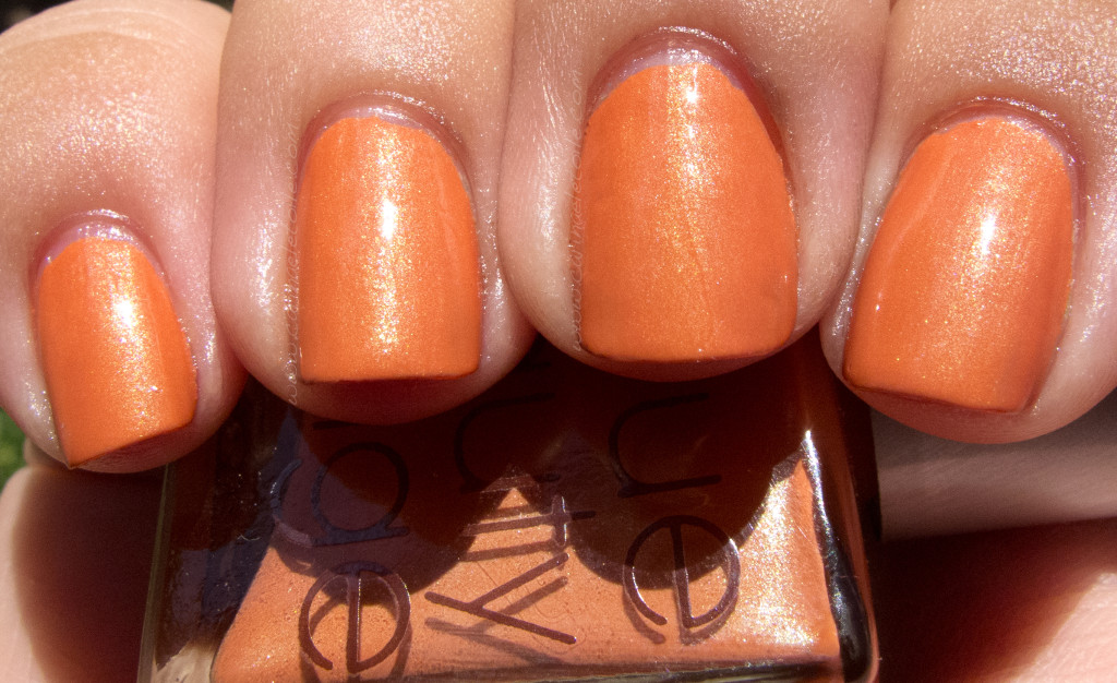
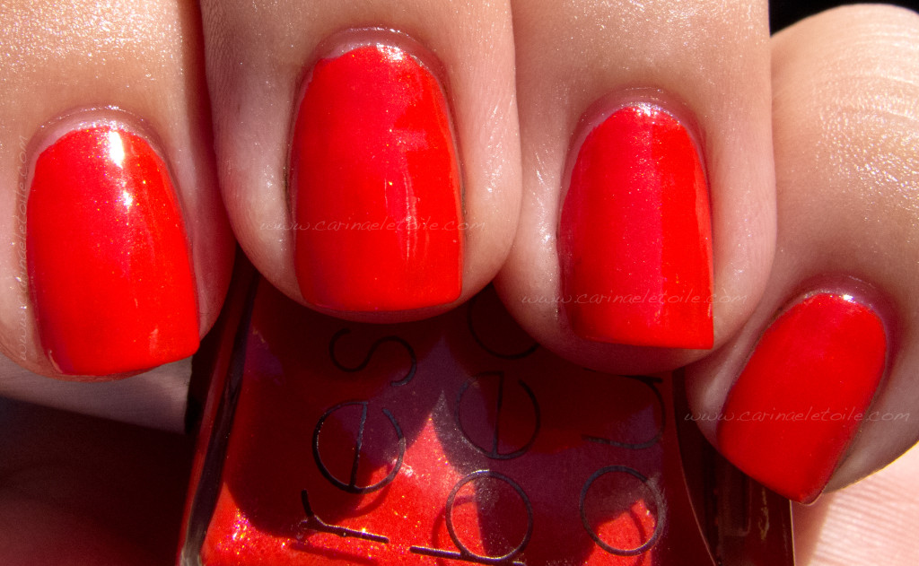
I fell for this color…like F E L L Â mega hard. This is the kind of orange that I would wear because it’s warm, it’s cool and it goes well with my skin tone. It’s not quite burnt and it is just absolutely heavenly! The shimmer in this isn’t subtle and can be seen in sunlight and in shade. This is one, as I said, is a color I fell for…can you see why?!
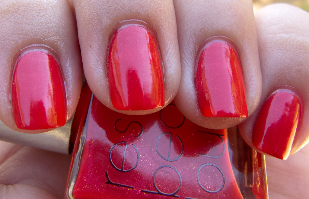
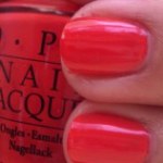
This color reminds me of RBL’s Bangin’, from a couple of years ago. It’s this beautiful red, but no hint of orange here. It’s a cool toned red with slight hints of shimmer that showed up in the bottle, but barely on my finger. It was hinted at when I moved my hands around to take pictures, but was incredibly hard to capture.
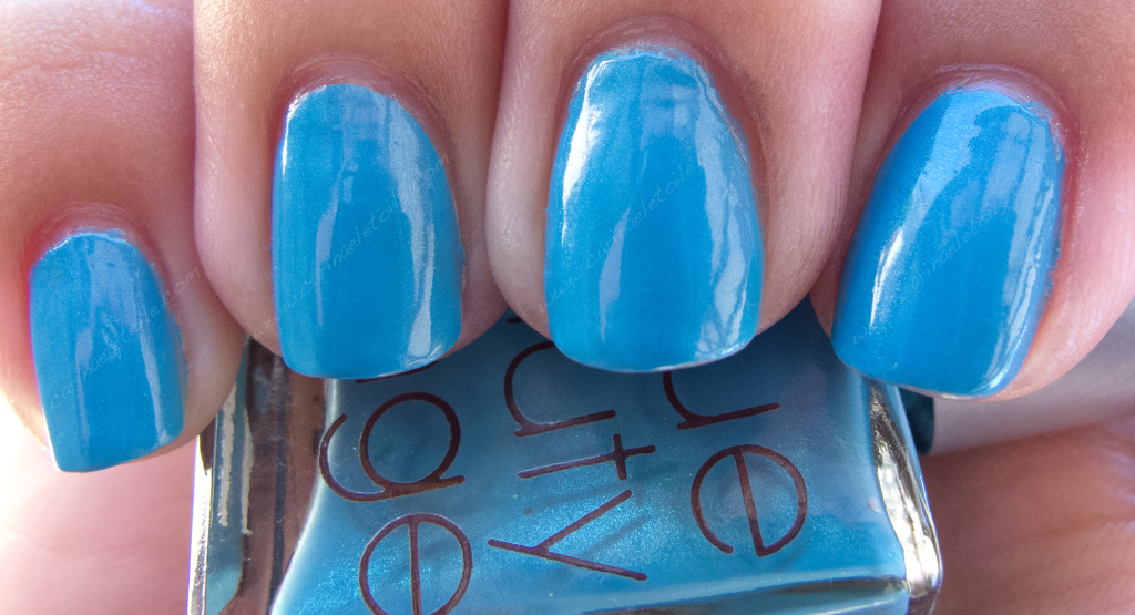
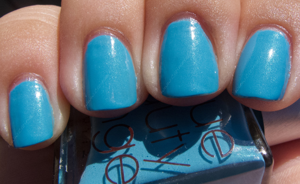
Faraway is this blue that reminds me of endless skies back in Arizona…and Sleeping Beauty turquoise. This is the kind of blue I am always looking for. While I’ve never been a fan of shimmer/pearlescent finishes, this has an extremely subtle blue-green shimmer.
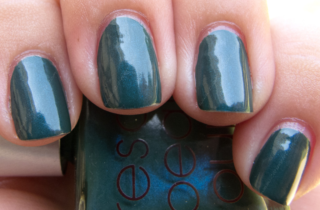
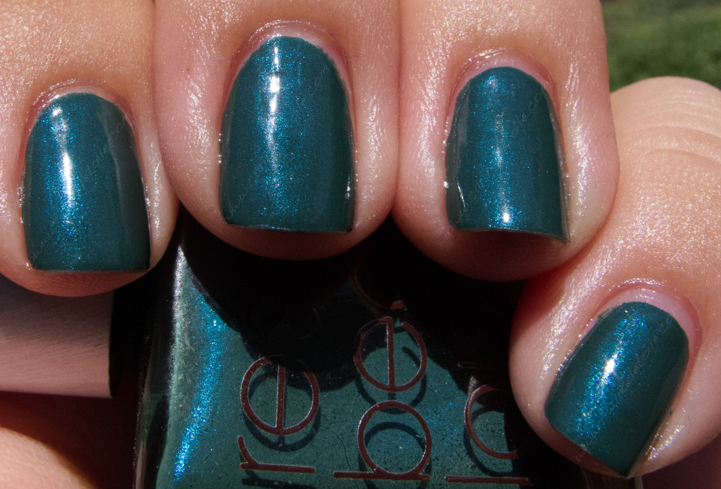
Jack was the color that drew me to this collection – the description alone had me swooning! A dark blue-green base with a turquoise shimmer had me wanting this color so badly. However, when I started swatching and wearing the other colors, I found this became my least favorite. It’s still pretty, but it’s not captivating like Abi for Faraway.
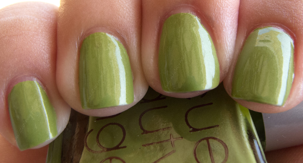
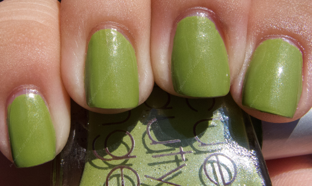
Abi is this gorgeous grasshopper-esque green with a slight yellow undertone. It also has a gorgeous pearlescent shimmer/shine running through it that keeps it from being muted. This is a gorgeous color and if you were fortunate enough to procure this color, you definitely know what I’m talking about.
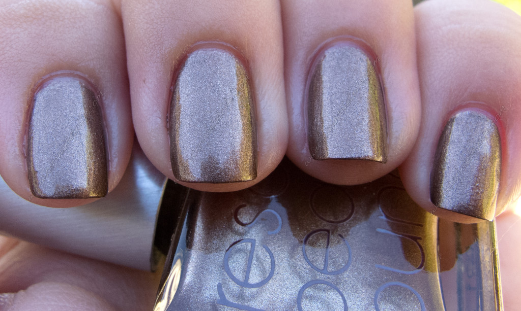
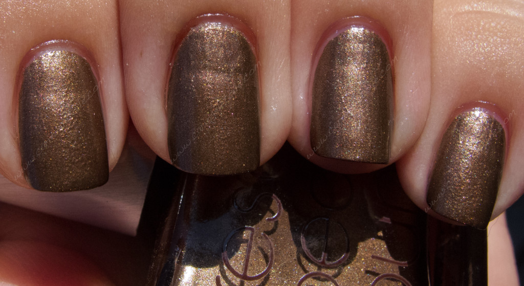
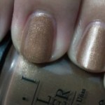
 Ghost is this bronze kind of thing. I can’t put my finger on it, but it’s a nice medium toned bronze with cool undertones. That’s hard to find in a bronze. Usually it’s warm and looks awful on me. The metallic shimmer in this livens up this color – isn’t it gorgeous? It’s almost like this iridescent, rainbow-y flash. This was different, making it my third favorite color from this collection.
Thanks for stopping by! Please click the Like button below if you liked what you read and saw.


