The collection overall wasn’t so bad. Formula was hit and miss and a bit too runny and thin. Because of that, it really shows in the swatches below. Please don’t laugh at the visible nail lines. I loved the colors and the preview swatch looks so much prettier than the actual colors look on me.
Essie’s Summer 2010 Collection

Looks pretty and enticing, right?
Look at the reality below.


Sunlight washed this color out, but I felt it was the prettiest of the lot…It did remind me of their blue collection from last summer.


A pretty pink that works for me, but pink isn’t my color.


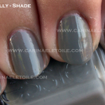
It looked like a grey in the bottle, but it ended up being a bit of a dull, lifeless beige on me. 


A pretty sea foam green.
Was this post interesting? Come read more!